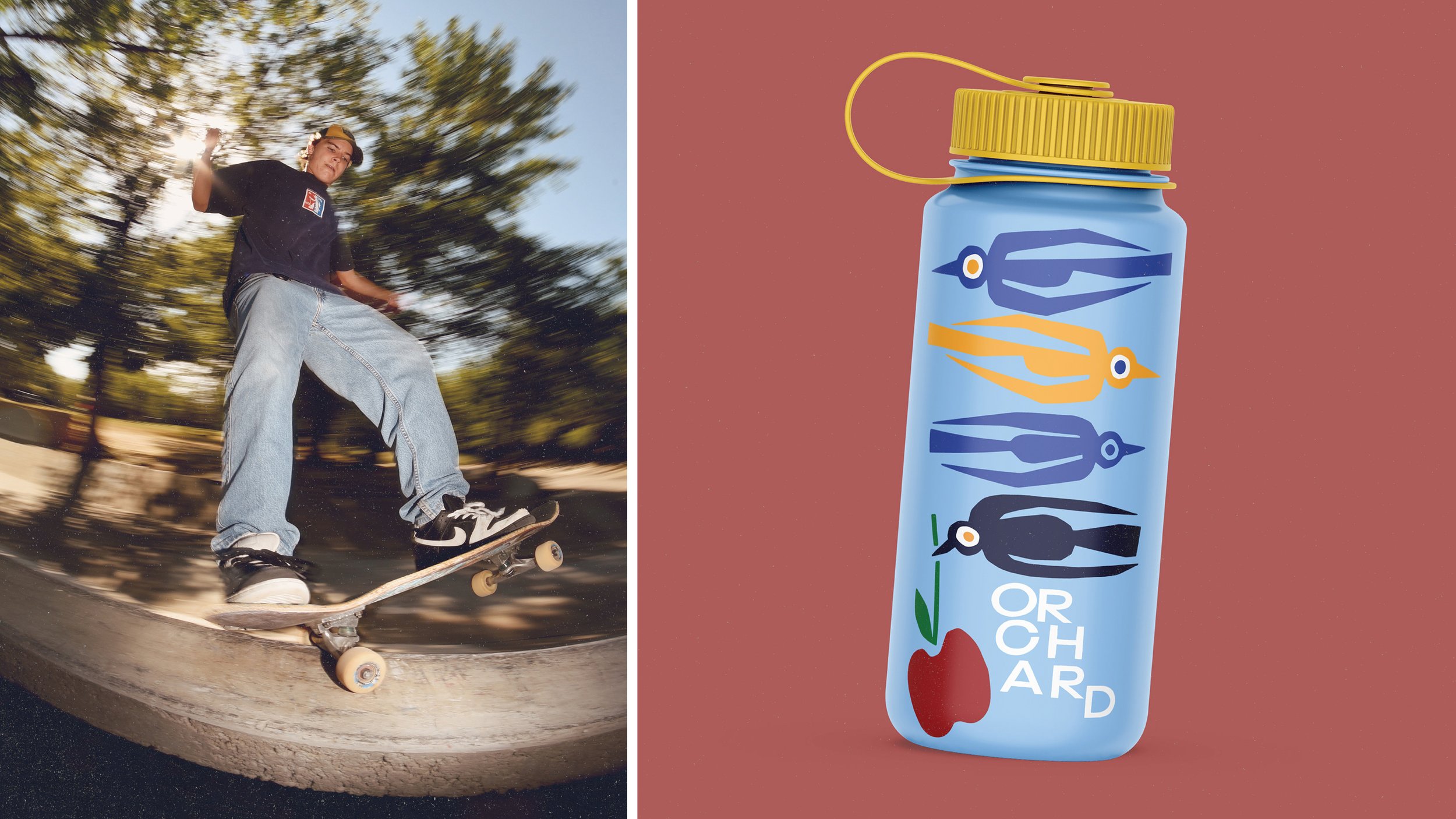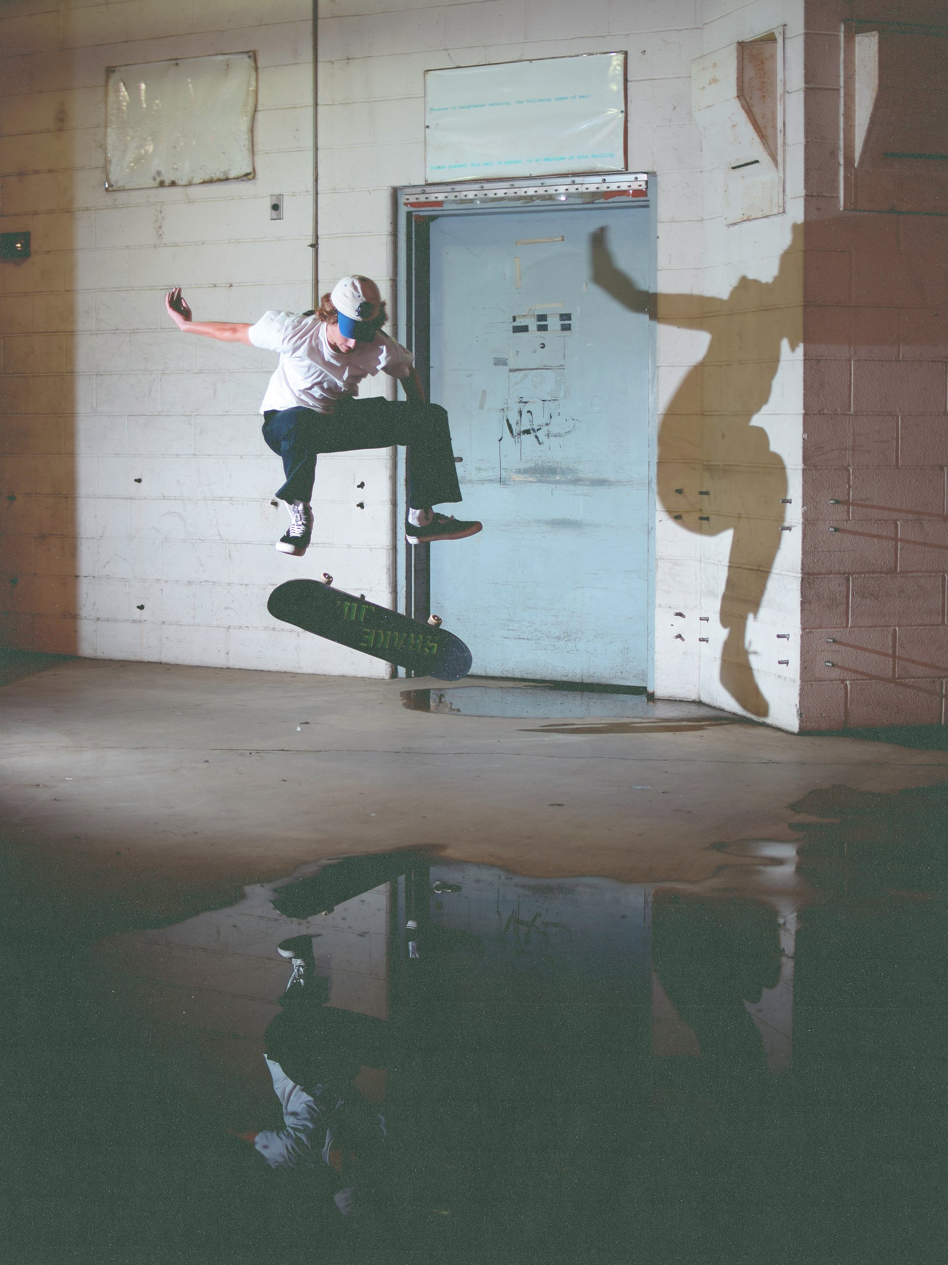
ORCHARD
SKATESHOP
BRANDING, publication, TRADEMARK DESIGN
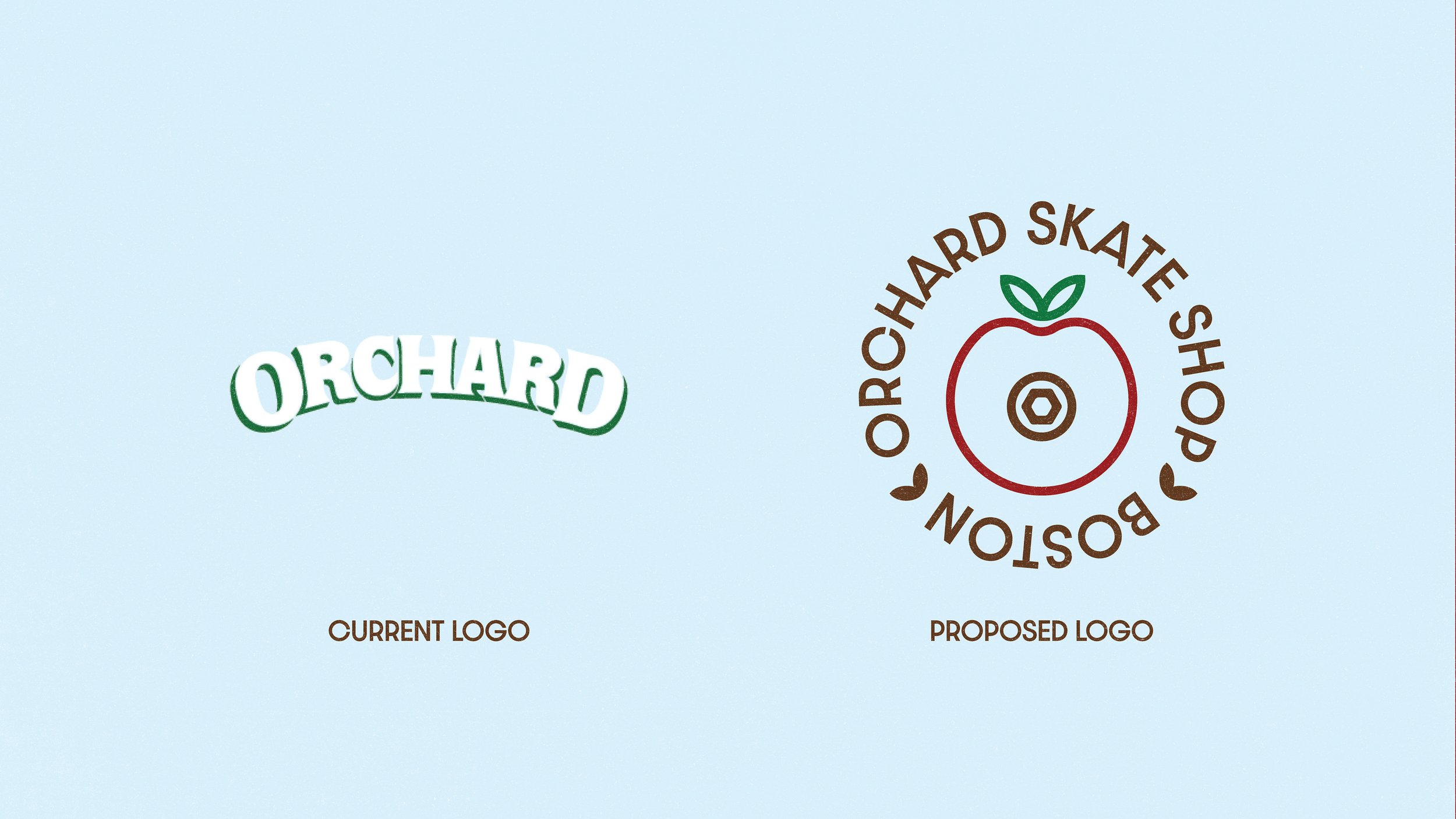
OBJECTIVE: To create a proposed rebrand for orchard skate shop that does not feel bound by age, gender, or experience, and is focused heavily on environmental impact, as well as supporting the local skateboarding community.
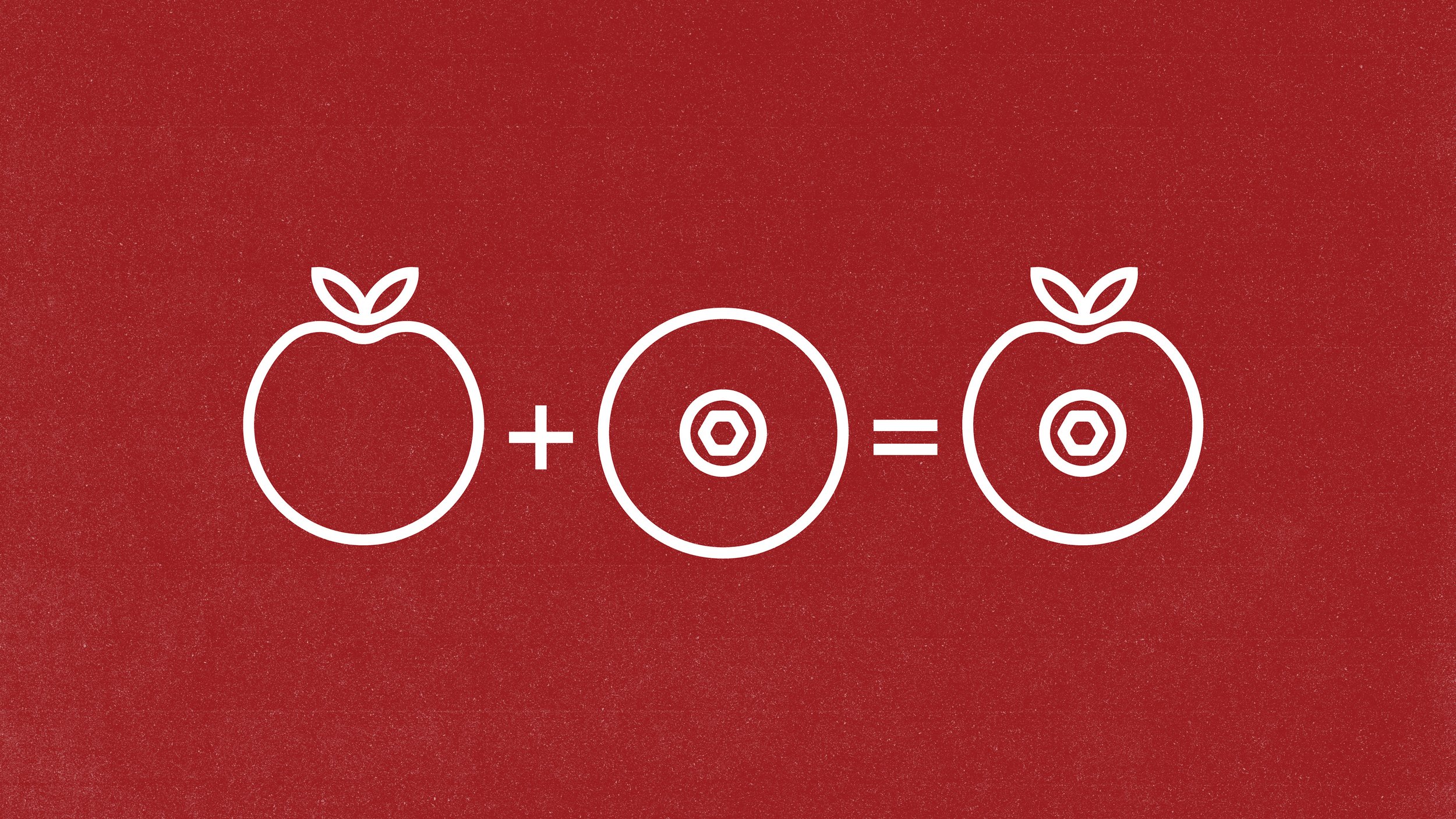
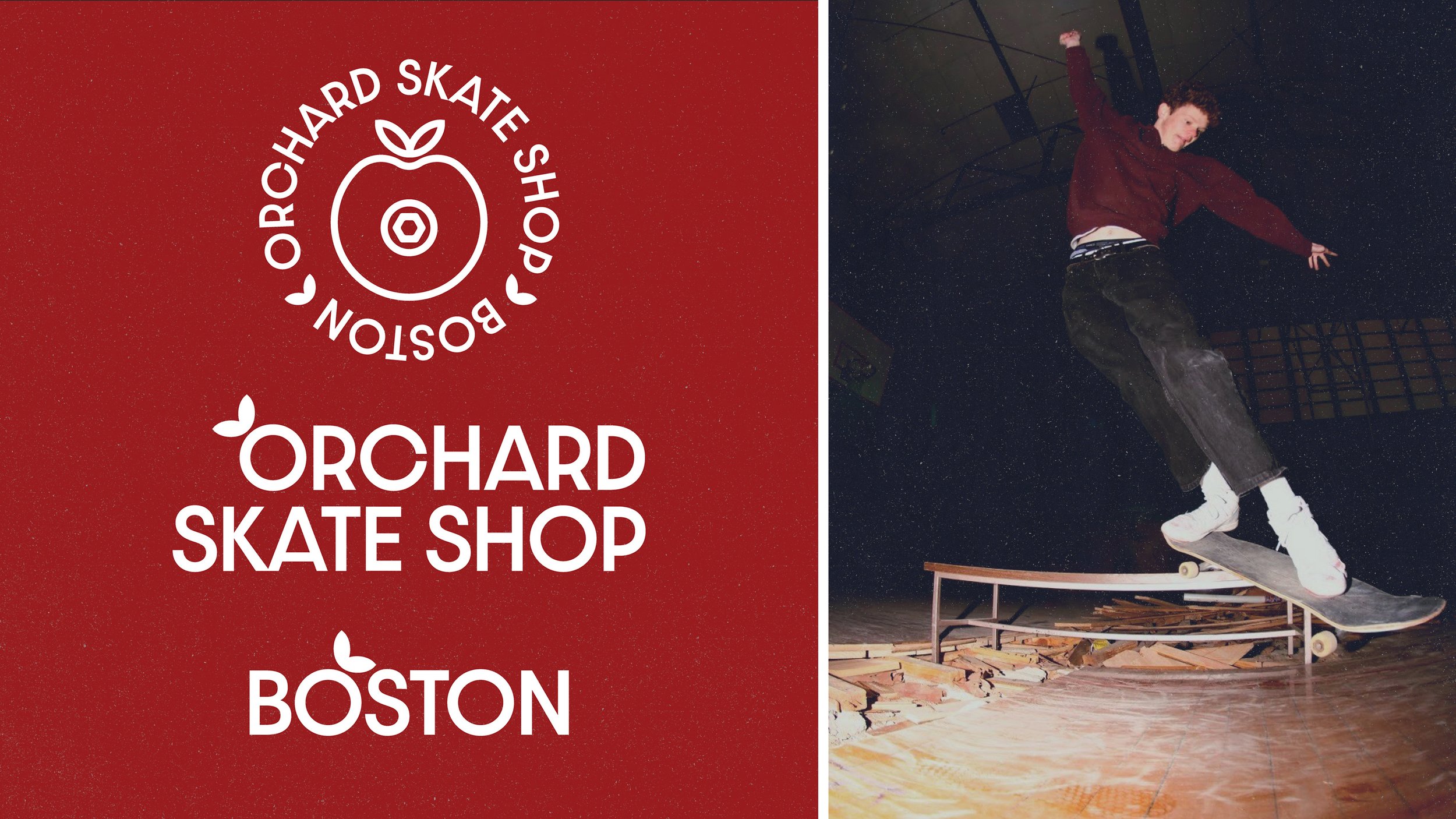
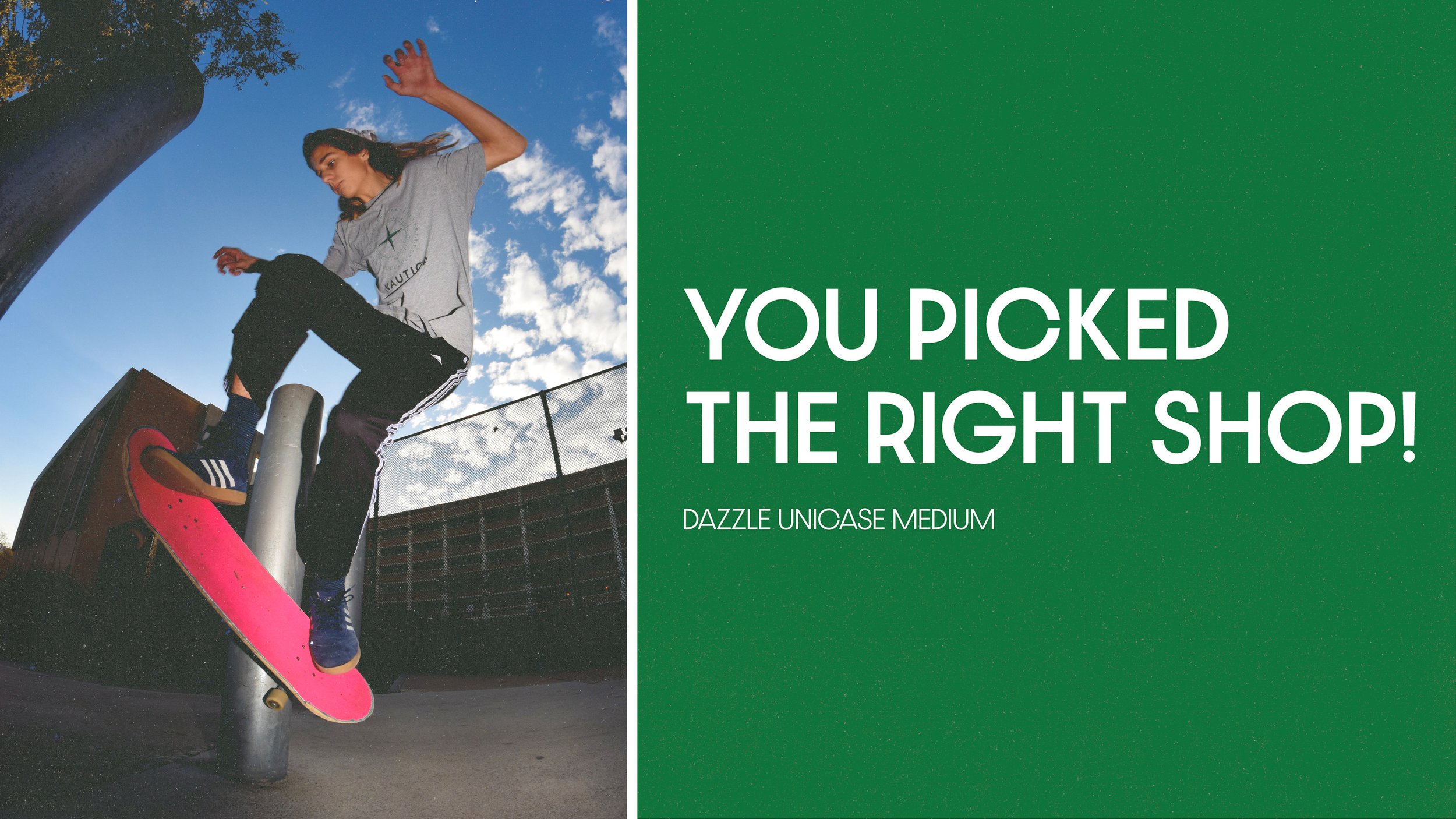
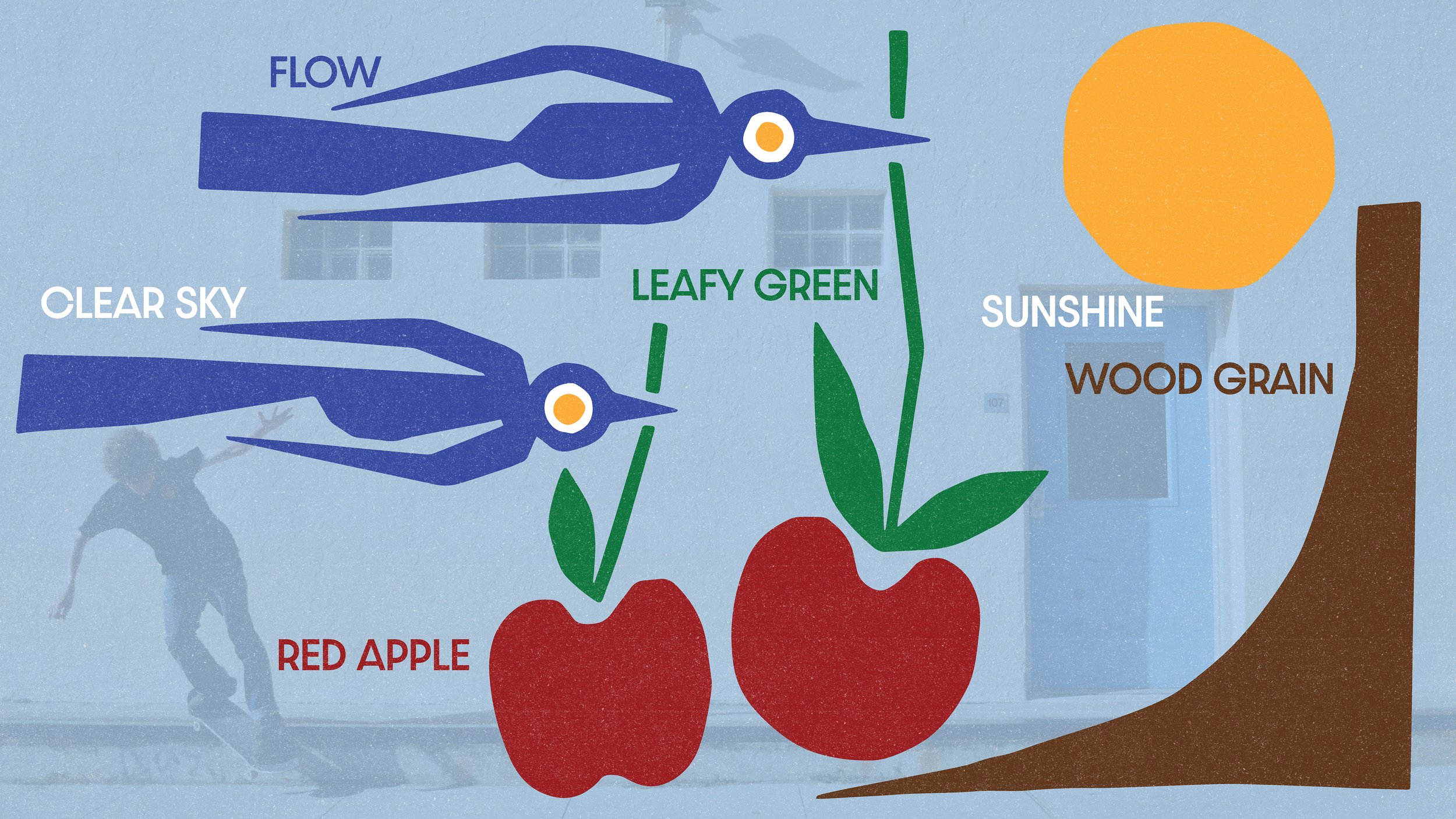
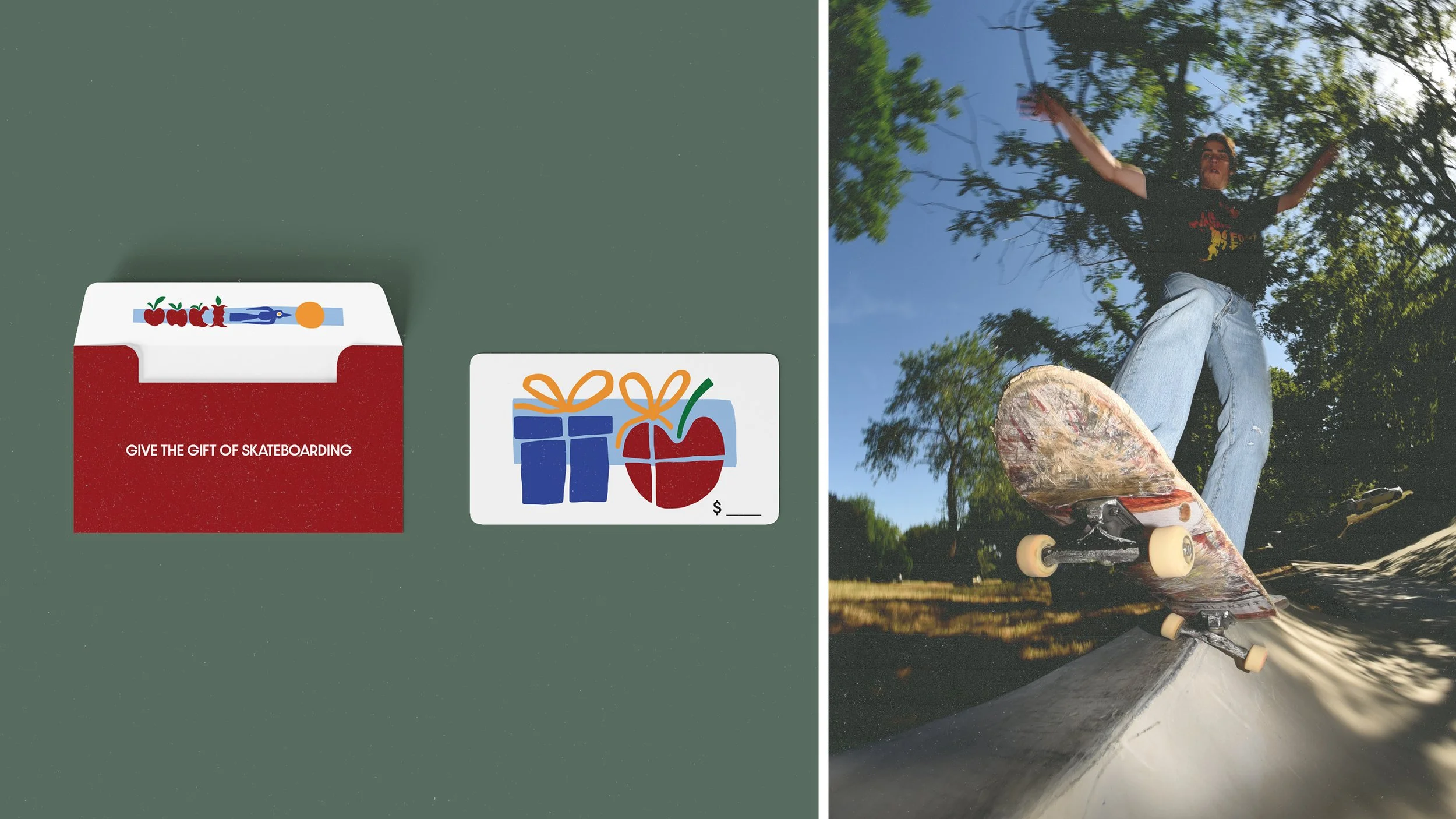
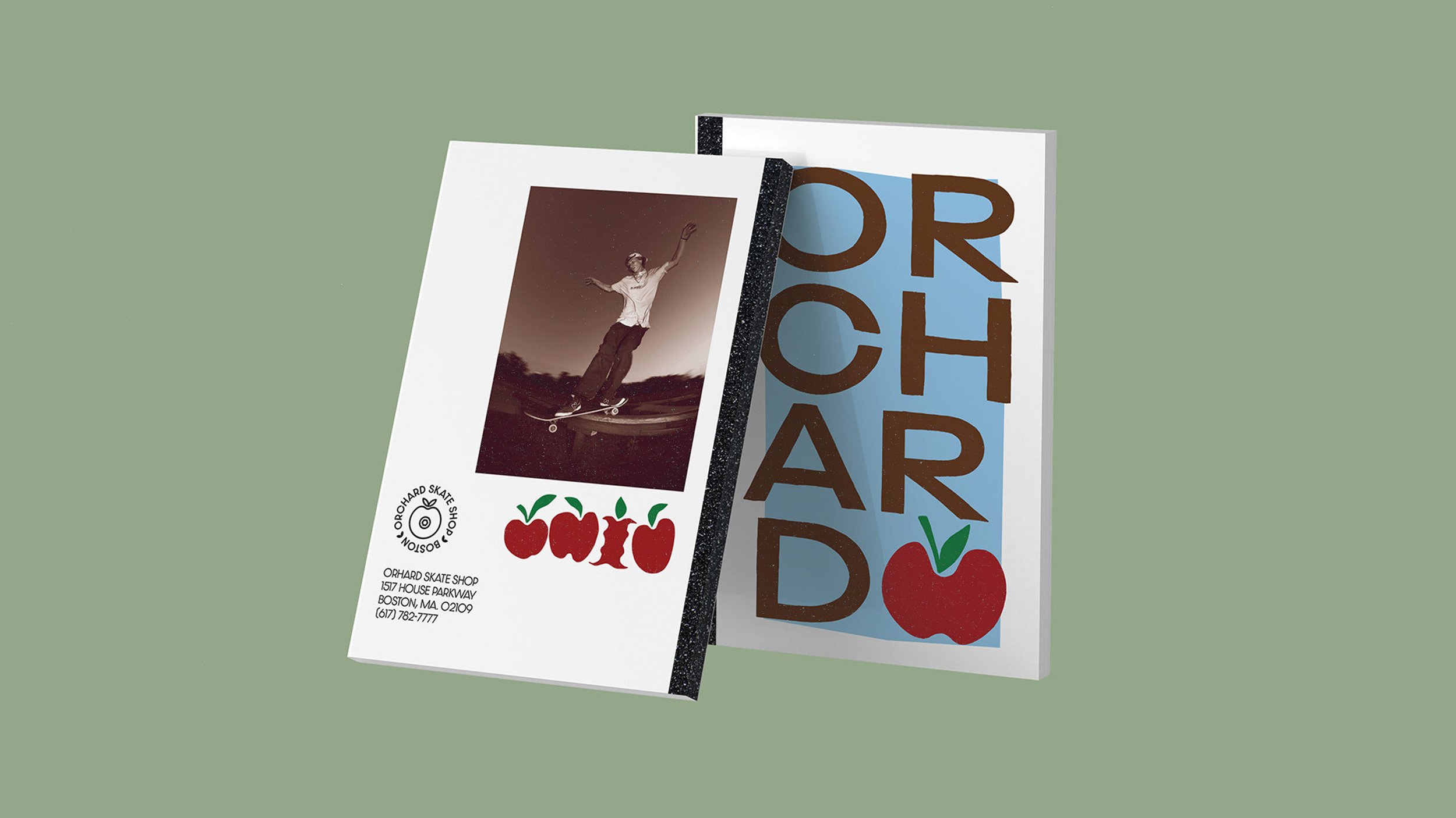
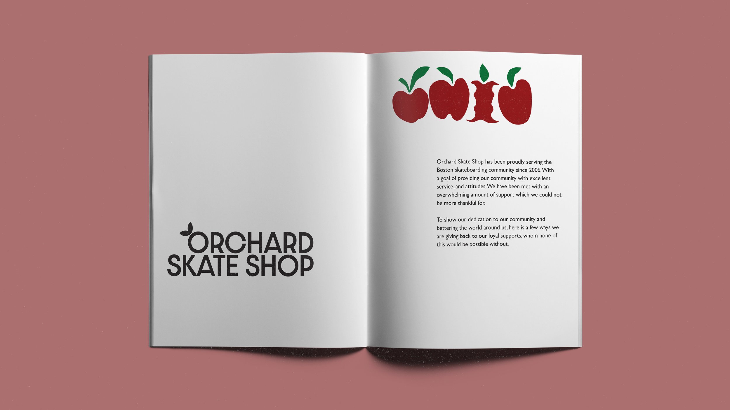
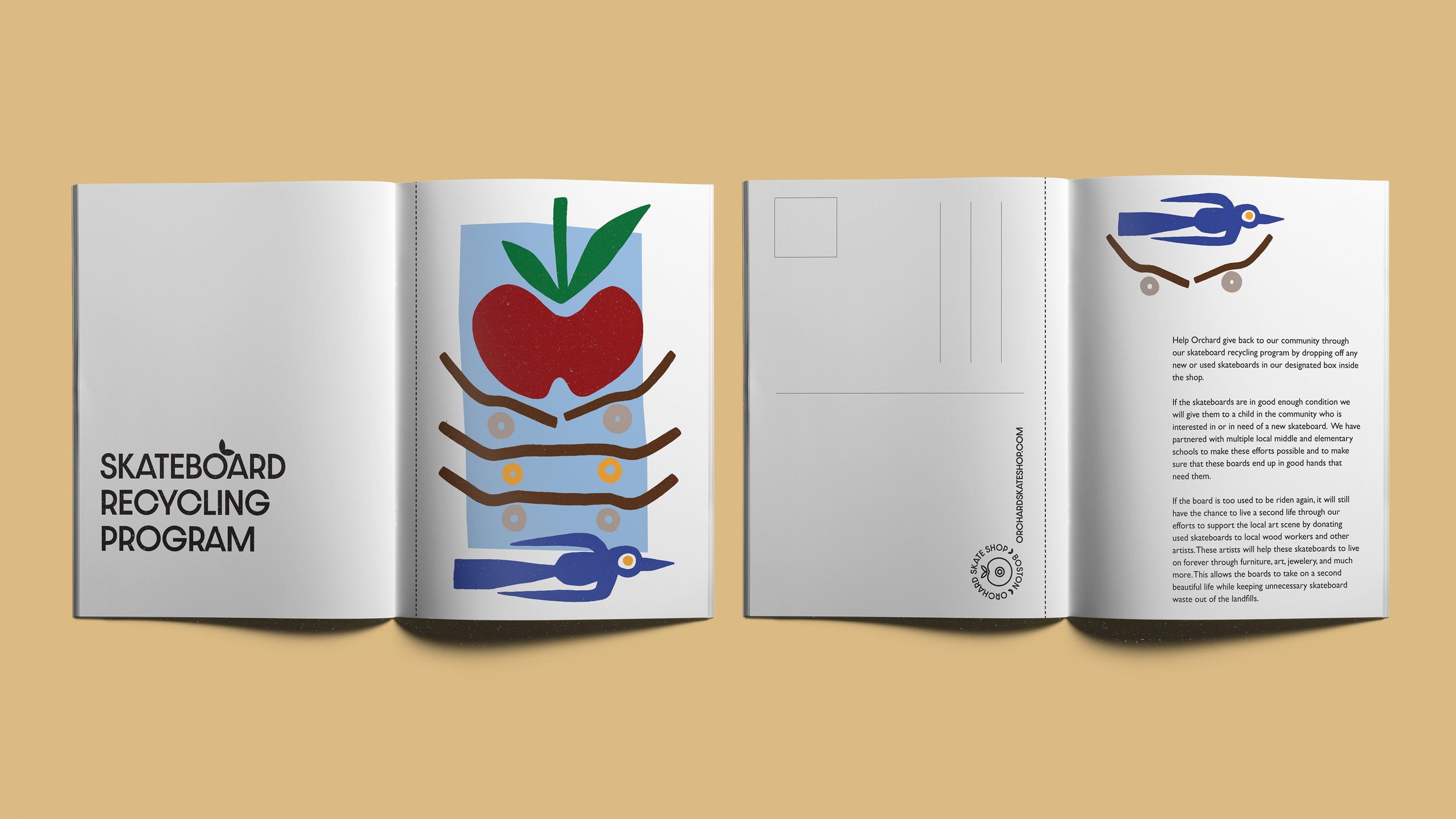
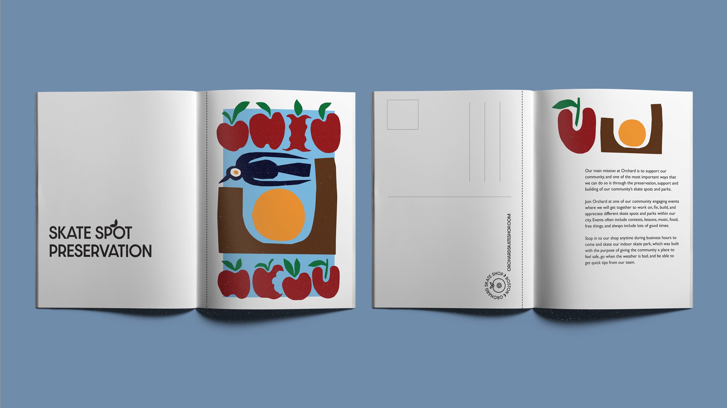
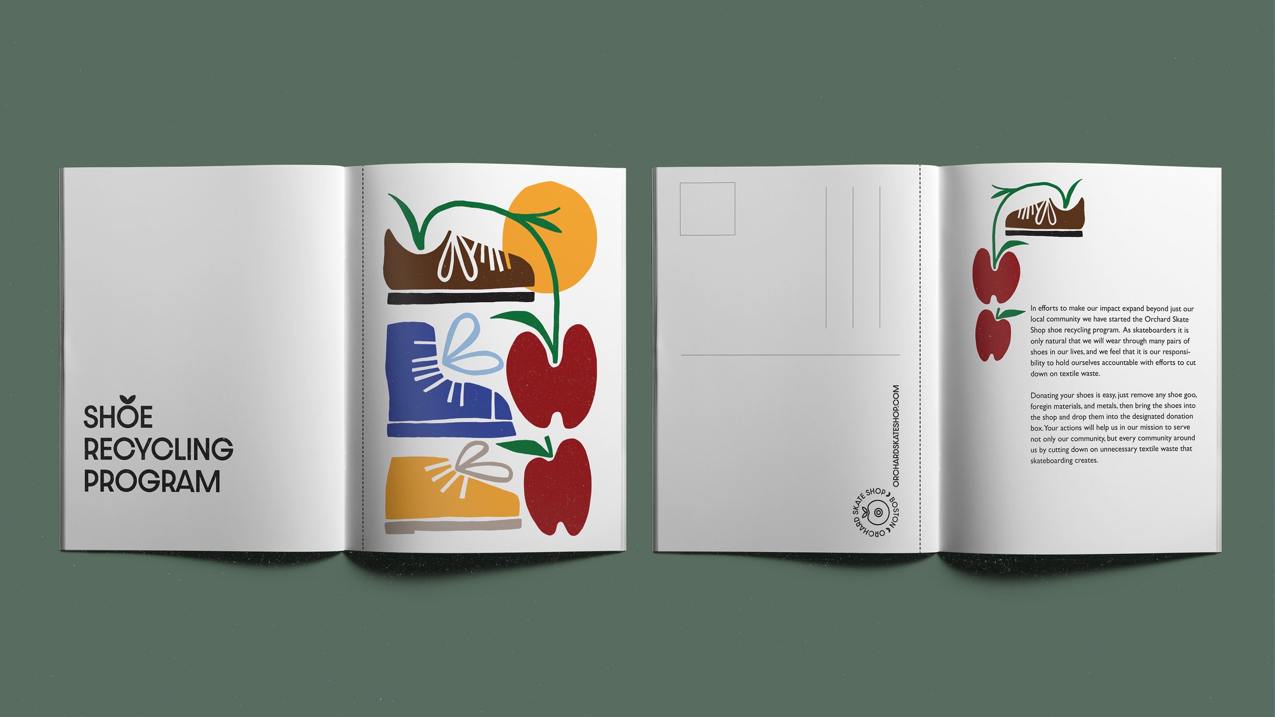
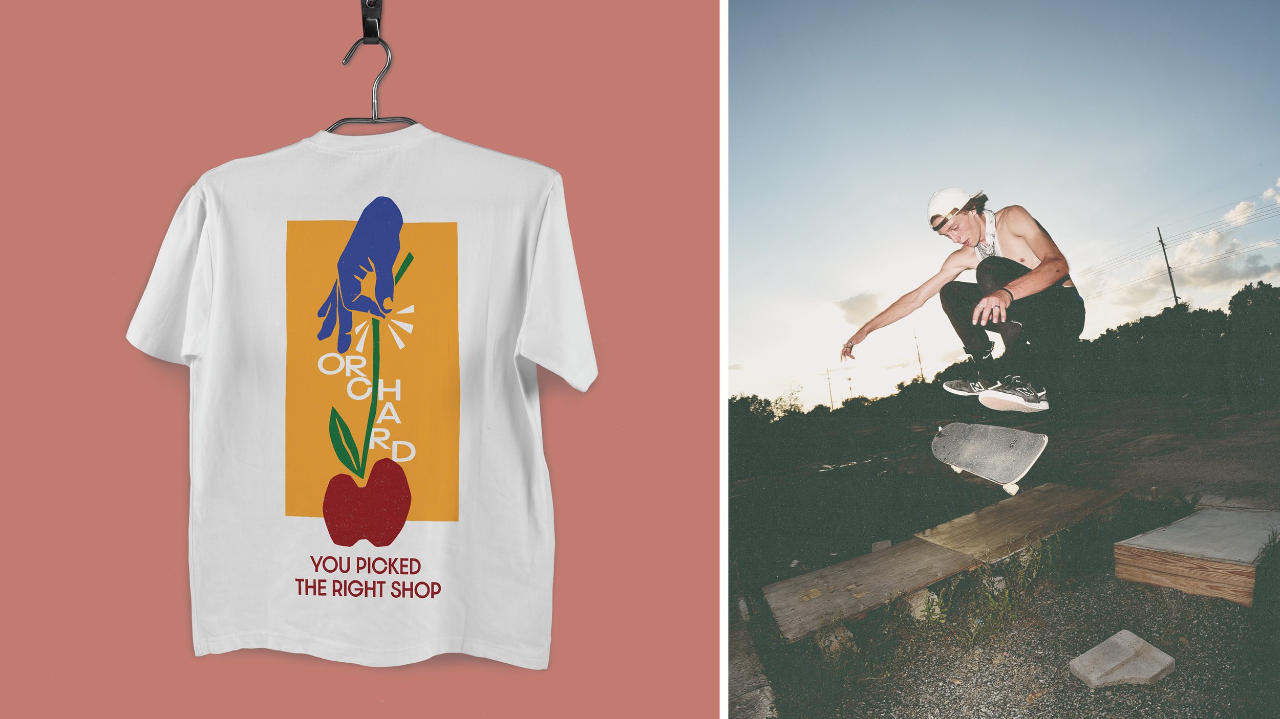
APPROACH: With a goal of diving into the brands identity I chose a color palette and illustration style that drew equal inspirations from nature, skateboarding, and community. A color palette based around primary colors gives a nod towards the colors that can easily be found in nature, while also referencing the lively nature of skateboarding from the graphics to the clothing. Illustrations were used to create motifs that can be seen throughout the project such as apples to create a strong and easily recognizable brand identity, while also focusing on highlighting the connection between skateboarding and nature.
AWARDS:
GRAPHIS NEW TALENT ANNUAL 2022
Brochure / Editorial | Silver Award
Branding System | Honorable Mention